Many a times we discard our photos just because they fail to impress us — might be because of colors, clarity or sharpness. Especially with landscape photographs, dull skies and flat tones completely break the aesthetics of an image. And we end up putting these images in the trash. But wait! How about adding some punch to these images in the digital darkroom? We can put in a little effort to enliven those images with minimal re-touching in Lightroom. We just need to add clarity, vibrance and saturation. Let’s see how each of these adjustments make the final image a keeper.
-
Clarity
In the Basics adjustment panel in Lightroom, there is a nifty control slider called Clarity under the Presence. This tool comes in handy to enhance the overall appeal of the image, but the results may not be very obvious in all the cases. The Clarity control basically adds mid-tone contrast to the image. This helps in bringing out the textures and fine details, thus making the image look a bit sharper and crisp. The photographs that inherently have lot of details like landscapes and cityscape shots, can really benefit a lot from the Clarity between +20 and +25. Let’s look at an example to see how clarity adds a subtle pop to the images.
Before Clarity: Look at the water ripples and the sands.
After Clarity: The water ripples, sand grains and wood texture start getting subtle definition when the clarity is boosted.
While you can go all the way from -100 to +100, but as you boost the value above +50 it starts degrading the result just like the over-sharpening does. And remember there’s no magic value. You may as well get lucky at +80.
-
Saturation
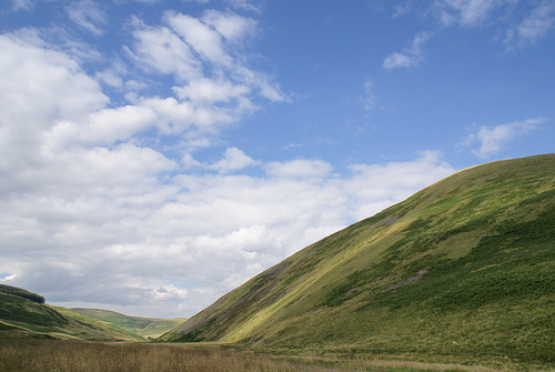
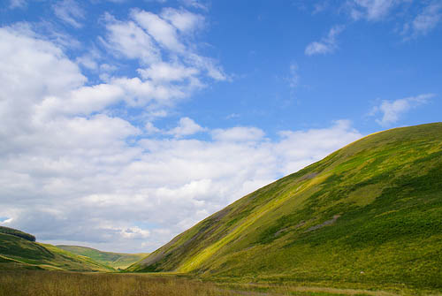
The next little trick that can make a lasting impression on your image is the color saturation. If the dull skies and flat green tones are breaking your image, it’s time to adjust the Saturation slider. The saturation slider essentially intensifies the overall colors and tones of the image. Because of this very nature of saturation slider, it should be used only when the overall color saturation needs to boosted (as in this image), else it is better to adjust the vibrance.
Before Saturation: Dull blues & flat green tones
After Saturation: Lively blue and with varied tones of green start showing up with color saturation.
-
Vibrance
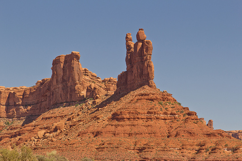
The better option to pop up the colors of the images is to use the Vibrance slider. While the saturation increases the intensity of all the colors & tones equally, Vibrance results in a more balanced saturation of colors. It intensifies the dull colors more than the already saturated colors, thus revealing more realistic looking colors. This tool smartly intensifies the colors so as to maintain a more natural appeal to the images. It also prevents skin tones from getting overly saturated. Let’s check out the before and after effect below.
Before Vibrance: Need to bring the dull sky to life. I choose to boost the vibrance.
After Vibrance: The colors are intensified and yet do not loose the natural appeal.
In this image, vibrance intensifies blue color more than the reds of the pyramid, whereas if we apply same amount of saturation, it will intensify reds as much as the blue. Check out below:

After Saturation +75
There are endless options to fine tune the images in Lightroom but sometimes nifty controls like clarity, saturation and vibrance can make a big difference to the images. So before stepping in for a giant leap, tap into the power of the basic adjustments.
How often do you use these adjustments?


I love APN! I just recently started subscription, and already I find the tips of great value. Thank you and keep the tips coming!
All the pictures have wonderfully improved. I aill myself make use of these simple advantages. Thank you Fred God