

Post-processing is all about adding some finishing touches to your photographs. And for you as a photographer these finishing touches define the difference between a professional photograph and a casual picture. The professionals rely on Photoshop actions and advanced techniques and spend a considerable amount of time to add these finishing touched. However as a photographer you only have to make subtle changes to keep your image looking natural while retaining the original mood and intent of the photograph. Here are certain parameters that you must (in almost all cases) adjust to take your results to the next level. Note that all these adjustments are done to tweak the results to your liking and make them look more finished and professional. Thus the adjustments should be subtle to retain the natural beauty of the photograph. Here they are in their order.
-
Exposure
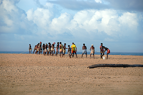
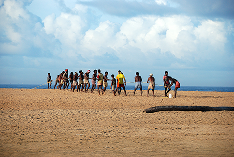
Exposure in post-processing terms is simply the amount of visible-light-information that has been captured. Ideally the camera tries to meter the scene and effectively capture an entire range of shadows, mid-tones and highlights. However sometimes some images may not have the required highlights or may be missing the shadow details (due to technical or lighting conditions). The camera metering is never perfect and can get tricked to underexpose or overexposed. This generally makes the photograph look dull and uninteresting. Start by using the auto-contrast feature in your image processor. This will stretch the tonal range of the photograph to fill the histogram thereby bringing in more details in the picture. Auto-Contrast is just a simplified name for automatically correcting the light-levels in a photograph. It doesn’t introduce or correct color-casts and thus retains the color balance of the original image while enhancing the brightness levels only. In the example below see how the original photograph looks good but benefits from the auto contrast function. A subtle change yet crucial to enhancing the photograph.

Before Auto Contrast

After Auto Contrast
-
Contrast
Contrast is the difference between the highlights and the shadows. The contrast emphasizes the various elements in an image by introducing a distinction between the brighter and the darker areas in a picture. A stark difference creates a high contrast image whereas a subtle difference in shadows and highlights creates a low contrast image. Portraits benefit from low contrast as it is more flattering to the human skin tones. High contrast on the other hand is more suited for landscapes, nature and wildlife photography. After correcting the contrast levels is the time to tune it for our own preference and we’ll be modifying the intensity of the shadows and highlights thereby altering the difference between them. Since this is done without affecting the brightness levels, changes to contrast affect only the highlights and shadows in the image leaving the mid-tones intact. Here’s an example of how this affects a natural scene. This shot was taken next to the sea beach where the camera lens’s front element quickly gathers the moisture in the air. This destroyed the contrast in the scene even though the camera exposed it properly. I thus had to boost the contrast to acceptable level to avoid the image looking washed out.
Original Image
Final Result — After Tweaking Contrast
-
White Balance
Technically speaking, the white light as it appears to our eyes is not white but is a tint of a tone between red and blue. This is because every light source emits light at a different temperature thus casting a color on the scene.It’s the beauty of nature that our bare eyes are quick to adapt to such changes in light and perceive the colors at their neutral tones. However the camera captures these color casts and tries to correct them in-camera. However as like any other machine, it has it’s own flaws. Ensuring correct white balance is the secret to great and true colors. However there are times when the white balance is correct. Creatively adjusting the white balance can introduce some subtle effects like altering the overall mood of the photograph. Sepia is a popular effect for portraits which induces sadness and adds a nostalgic mood to photographs. Here’s an example. I took this shot in the morning backlit with the rays of the rising sun. To the bare eyes it looked a beautiful golden however the camera tried to neutralize the colors detecting it as a color cast. Adding a slight tone of orange-yellow brought back the golden color of the original scene.

Original Image — Without White-Balance Correction
Final Result — After White-Balance Correction
-
Saturation
Saturation depicts the strength or intensity of colors. De-saturation results in a black and white photograph whereas overly saturated images look surreal and unnatural. Boosting the saturation levels brings landscapes and natural scenes to life and brings-in vibrant, vivid, lively and intense colors to complement the nature. On the other hand slightly desaturated colors are flattering to the skin tones and even alter the mood of the photograph and make it feel dull yet appealing. Some of the digital cameras today tend to achieve optimum saturation without affecting the skin tones. Consider reducing saturation when working on portraits to attain natural looking soft skin tones. Here’s an example. The first shot has natural colors. However I liked the contrasting colors. Tweaking the saturation brought in the beautiful green of the parrots combined with the red beaks all together against a blue sky.

Original Photograph — Natural Colors

Final Result With Tweaked Saturation
-
Sharpness
How clearly the edges of objects are defined produces the sharpness in an image. The sharpness of an image depends on various parameters — quality of your equipment (camera & lens), usage of small aperture, reducing or eliminating the possibilities of camera-shake and the proper focus. However one element in your digital camera is responsible for reducing the sharpness of the images. This is due to a process known as bayer interpolation which occurs during the capture of the image. In summary, what happens is that an image is composed by joining its three constituent colors — red, green, blue — which are all individual pixels. In this process some pixel sharpness is lost. This doesn’t happen in film cameras in which the image is captured in an analog form. Thus recovering sharpness is crucial. Though all scenes may benefit from sharpness, portraits tend to be more sensitive and the blemishes in the skin often become more pronounced. As a rule of thumb, when sharpening portraits pay close attention to the eye of the subject and sharpen only enough to keep the eye maintain its beautiful reflection. When sharpening, always preview the image at 100% to ensure that there is no over-sharpening. If post-processing for print, try applying higher sharpness to account for screen resolution to printer resolution conversation as well as depending on the print size that you want. Here’s a shot with and without the sharpness applied. This is a 100% crop of the original to show the differences.

Original Image With No Sharpening Applied

Final Result With Sharpening Applied
Bonus Tips
- While all the adjustments are subtle, they have a considerable effect on the final image once all these effects have been applied. Thus make sure to avoid making extreme adjustments. This helps retain the natural qualities of the images while giving your photographs a professional finishing touch.
- Red is a very strong color and adds a lot of drama and interest to an image. When working on colors pay attention to the reds and try to keep them in control.
- Most of the times you’ll come across pictures which don’t look much. But given the correct lighting and composition, they can still be post-processed into professional results. Never be afraid to experiment.
- All these adjustments are crucial but may vary in amount depending on your preference and the individual shots.
I hope this article helps you add the final finishing touches and takes your photographs to the next level. What all adjustments do you make to your photographs?

Thanks for the explanation!
SO what’s the difference between exposure and contrast (#1 and #2)? You talk abut exposure in #1, then use auto-contrast to stretch the tonal range. How do you boost the contrast in #2, and how is that different than what you do in #1?
Thanks.