Color management is the technique of achieving consistent colors across various imaging-devices. So, whether you are editing the photograph in Photoshop or viewing the same photograph on your cellphone or printing it out on paper — it should look the same on all media. However in reality there’s quite a difference when you view the same image on your PC and on your TV. Achieving color-consistency calls for color-management awareness.
Introduction To Color Management
While color-management seems to be complicated, the basic principles are pretty easy to grasp; and will help you in understanding the complicated stuff with a sound knowledge of the fundamentals.
Color-management becomes very simple to understand with a very general scenario. Let’s say you have a standard flat-screen monitor. You have an image you want to retouch. And you’d send it to your friend who has a wide-gamut flat-screen monitor. Viewing the same image on your friend’s monitor, you’ll notice that there’s considerable difference between what you saw on your monitor and what you see here. And to add further twist to the tale, you also want to print the image. So how accurate is the view? Which monitor do you trust and how can you ensure that you print what you see? For this you’ll have to ensure that your monitor’s color reproduction is accurate for both the monitors and that the image itself contains accurate colors (more on this later).
Color-Space
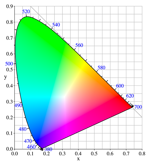
Color-space is like a playground. The larger the playground, the more the number of available colors. Thus, before we start playing around with the colors, we have to define a common-ground with the largest number of colors which devices or images can use. The color-managed applications and knowledge of commonly used working spaces come in handy for achieving color consistency across the devices.Now since we’ll be working with various color-spaces, we need to define a standard color-space which is a larger space (a super-set) of all possible colors. The Commission International de l’éclairage (CIE) does this for us. The CIE has defined a colorspace large enough so that all other device profiles fall within it. This is the standard CIE colorspace and all other commonly used color-spaces fall within it. You can learn more about color spaces and commonly used working spaces here.

Color-Profiles And Devices
Different devices have different display characteristics. So, one display may be brighter and another slightly dim. One may have more vivid colors and another one more toned down. In technical terms every device has a color-profile which contains the performance characteristics of the device. Depending on the device, this profile may be provided by the manufacturer or can be created by the users like us with some special attachment/instruments. This color-profile acts like a dictionary which is used to map the colors in the image to the display’s characteristics for producing accurate colors.
The Image
Usually the image itself carries an embeded color-profile of the device that created it. For example a photograph from a typical Nikon camera will have the color-profile embeded to indicate the color characteristics of the image.
Once you have an image that has it’s color-profile embedded, and you know what you see on the monitor is accurate, you need an imaging-application or imaging-software that is color-profile-aware (technically referred to as color-managed). Let’s have a look at what is meant by color managed application and how a color managed application helps in attaining color-consistency.
Color-Managed Image Viewer & Editor
A color-managed application is an image editing software which respects the color profile of the image while editing and displaying it. Any professional image editors will be color-managed (like Photoshop or Lightroom). The color-managed application will also allow you to embed and save this color-profile when you save the image. When the color managed application embeds the color information, it plays safe on color-consistency across calibrated devices. As in our example above, when you open the same image file on the wide-gamut monitor, the color managed application reads the embedded color-profile of the image and gives option to the user to select the most appropriate color space. By default, it retains the color information embedded by source system. In our scenario, we have two different devices, and therefore two different color-profiles. So, when you open the image on wide-gamut monitor (which follows wRGB working space), a color managed application either uses the embeded color-profile of the image and maps it to the working space real-time or it can convert it to the working space so that the image will then use the working space instead of the previously embeded image. Color-managed imaging software are aware of device’s color-profile which enables them to accurately translate or map the image’s color-profile for the display.
Color Are Accurate As Long As Color-Profiles Are Respected
Assignment of the correct color-profile to the image, the process of device calibration and ICC aware application, all the three things are essential for rendering accurate colors across the devices in imaging chain. The failure on part of any one parameter results in the discrepancies in the final output; be it on target computer or in form of final print. So, next time you are printing your images or perhaps viewing the images on other system and you notice the color-shift in the result, you know what is lacking — The Color Management.
Want to learn more about color spaces and working spaces. Check out the articles titled Introduction to color spaces and Working Spaces — sRGB vs aRGB vs ProPhoto RGB.

